Setting up social cards
Material for MkDocs can automatically create beautiful social cards for your documentation, which appear as link previews on social media platforms. You can select from several pre-designed layouts or create custom layouts to match your unique style and branding.
How to build custom social cards by @james-willett – 24m – Learn how to create entirely custom social cards perfectly matching your branding for each page automatically!
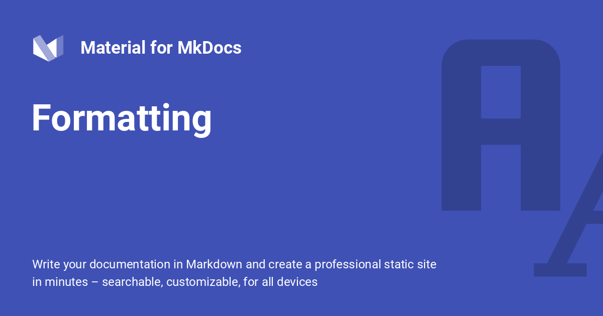
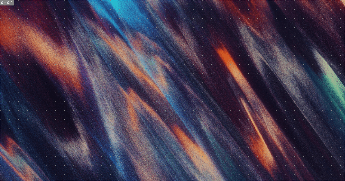
Social card of our formatting reference
Configuration
Built-in social plugin
8.5.0 create-social-cards
The built-in social plugin automatically generate a custom preview image for each page. Install all dependencies for image processing and add the following lines to mkdocs.yml:
For a list of all settings, please consult the plugin documentation.
The site_url setting must be set
Note that you must set site_url when using the social plugin, or the generated cards will not be correctly linked. Social media services like X and Facebook demand that social previews point to an absolute URL, which the plugin can only compute when site_url is set. Example:
Usage
If you want to adjust the title or set a custom description for the social card, you can set the front matter title and description properties, which take precedence over the defaults, or use:
Choosing a font
Some fonts do not contain CJK characters, like for example the default font, Roboto. In case your site_name, site_description, or page title contain CJK characters, choose another font from Google Fonts which comes with CJK characters, e.g. one from the Noto Sans font family:
Changing the layout
If you want to use a different layout for a single page (e.g. your landing page), you can use the social front matter property together with the cards_layout key, exactly as in mkdocs.yml:
You can apply those changes for entire subtrees of your documentation, e.g., to generate different social cards for your blog and API reference, by using the built-in meta plugin.
Parametrizing the layout
Besides changing the entire layout, you can override all options that a layout exposes. This means you can parametrize social cards with custom front matter properties, such as tags, date, author or anything you can think of. Simply define cards_layout_options:
---
social:
  cards_layout_options:
    background_color: blue # Change background color
    background_image: null # Remove background image
---

# Page title
...
You can apply those changes for entire subtrees of your documentation, e.g., to generate different social cards for your blog and API reference, by using the built-in meta plugin.
Disabling social cards
If you wish to disable social cards for a page, simply add the following to the front matter of the Markdown document:
Customization


Social cards are composed of layers, analogous to how they are represented in graphic design software such as Adobe Photoshop. As many layers are common across the cards generated for each page (e.g., backgrounds or logos), the built-in social plugin can automatically deduplicate layers and render them just once, substantially accelerating card generation. The generated cards are cached to ensure they are only regenerated when their contents change.
Layouts are written in YAML syntax. Before starting to create a custom layout, it is a good idea to study the pre-designed layouts, in order to get a better understanding of how they work. Then, create a new layout and reference it in mkdocs.yml:
Note that the .yml file extension should be omitted. Next, run mkdocs serve, and see how the .cache directory is populated with the generated cards. Open any card in your editor, so you can see your changes immediately. Since we haven't defined any layers, the cards are transparent.
The following sections explain how to create custom layouts.
Size and offset
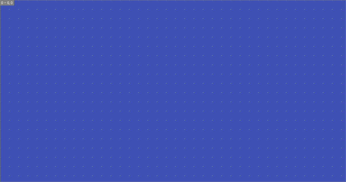
Each layer has an associated size and offset, which is defined in pixels. The size is defined by a width and height property, and the offset by x and y properties:
size: { width: 1200, height: 630 }
layers:
  - size: { width: 1200, height: 630 }
    offset: { x: 0, y: 0 }
If the size is omitted, it defaults to the size of the layout. If the offset is omitted, it defaults to the top left corner, which is the default origin. Saving the layout and reloading renders:
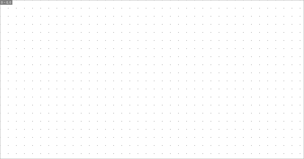
The layer outline and grid are visible because we enabled debug mode in mkdocs.yml. The top left shows the layer index and offset, which is useful for alignment and composition.
Origin
The origin for the x and y values can be changed, so that the layer is aligned to one of the edges or corners of the layout, e.g., to the bottom right corner of the layout:
size: { width: 1200, height: 630 }
layers:
  - size: { width: 1200, height: 630 }
    offset: { x: 0, y: 0 }
    origin: end bottom
The following table shows the supported values:
| Origin | ||
|---|---|---|
start top | center top | end top |
start center | center | end center |
start bottom | center bottom | end bottom |
Backgrounds
Each layer can be assigned a background color and image. If both are given, the color is rendered on top of the image, allowing for semi-transparent, tinted backgrounds:

Background images are automatically scaled to fit the layer while preserving aspect-ratio. Notice how we omitted size and offset, because we want to fill the entire area of the social card.
Typography
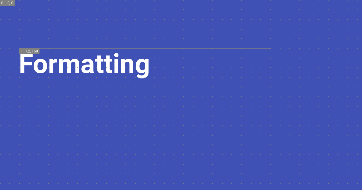
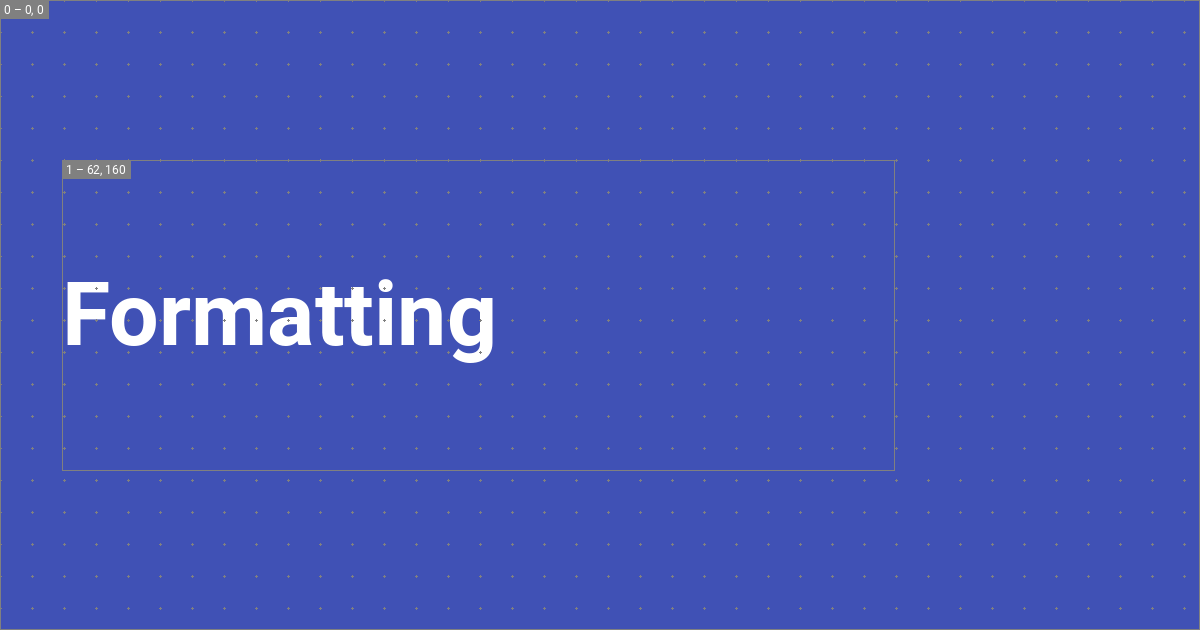
Now, we can add dynamic typography that is sourced from Markdown files - this is the actual raison d'être of the built-in social plugin. Jinja templates are used to render a text string that is then added to the image:
size: { width: 1200, height: 630 }
layers:
- size: { width: 832, height: 310 }
offset: { x: 62, y: 160 }
typography:
content: "{{ page.title }}" # (1)!
align: start
color: white
line:
amount: 3
height: 1.25
font:
family: Roboto
style: Bold
-
The following variables can be used in Jinja templates:
The author is free in defining
layout.*options, which can be used to pass arbitrary data to the layout frommkdocs.yml.
This renders a text layer with the title of the page with a line height of 1.25, and a maximum number of 3 lines. The plugin automatically computes the font size from the line height, the number of lines, and font metrics like ascender and descender.1 This renders:
Overflow
If the text overflows the layer, there are two possible behaviors: either the text is automatically truncated and shortened with an ellipsis, or the text is automatically scaled down to fit the layer:
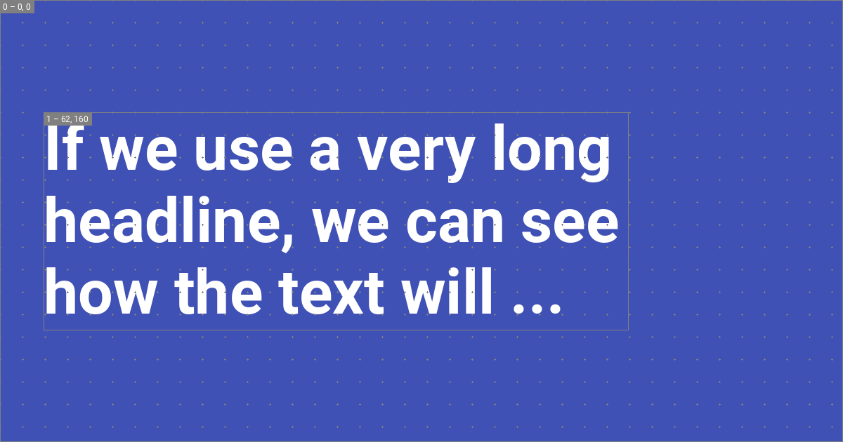
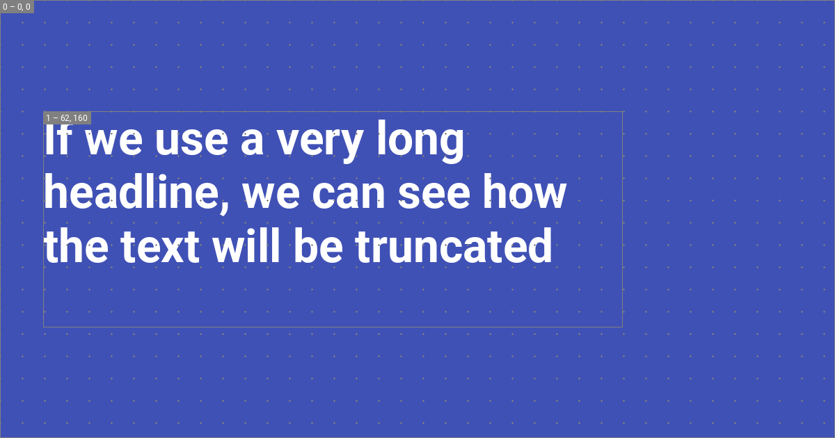
While truncating with an ellipsis is the default, auto-shrinking can be enabled by setting overflow to shrink:
size: { width: 1200, height: 630 }
layers:
- size: { width: 832, height: 310 }
offset: { x: 62, y: 160 }
typography:
content: "{{ page.title }}"
overflow: shrink
align: start
color: white
line:
amount: 3
height: 1.25
font:
family: Roboto
style: Bold
Alignment
Text can be aligned to all corners and edges of the layer. For example, if we want to align the text to the middle of the layer, we can set align to start center, which will render as:
The following table shows the supported values:
| Alignment | ||
|---|---|---|
start top | center top | end top |
start center | center | end center |
start bottom | center bottom | end bottom |
Font
The built-in social plugin integrates with Google Fonts and will automatically download the font files for you. The font property accepts a family and style property, where the family must be set to the name of the font, and the style to one of the supported font styles. For example, setting family to Roboto will automatically download the following files:
.cache/plugins/social/fonts
└─ Roboto/
├─ Black.ttf
├─ Black Italic.ttf
├─ Bold.ttf
├─ Bold Italic.ttf
├─ Italic.ttf
├─ Light.ttf
├─ Light Italic.ttf
├─ Medium.ttf
├─ Medium Italic.ttf
├─ Regular.ttf
├─ Thin.ttf
└─ Thin Italic.ttf
In that case, the author can use Bold or Medium Italic as the style. If the font style specified in the layer is not part of the font family, the font always falls back to Regular and prints a warning in debug mode, as Regular is included with all font families.
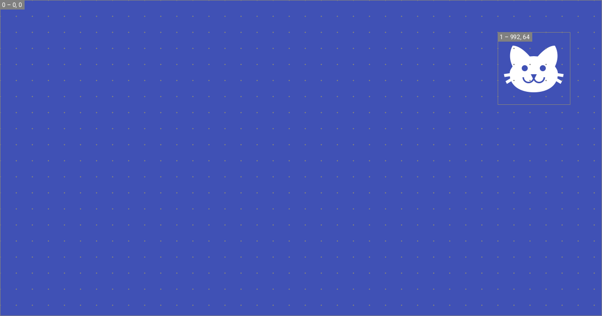
Icons
Authors can leverage the full range of icons that are shipped with Material for MkDocs, or even provide custom icons by using theme extension and going through the process described in the guide on additional icons. Icons can even be tinted by using the color property:
size: { width: 1200, height: 630 }
layers:
  - background:
      color: "#4051b5"
- size: { width: 144, height: 144 }
offset: { x: 992, y: 64 }
icon:
value: material/cat
color: white
This will render the icon in the top right corner of the social card:
The possibilities are endless. For example, icons can be used to draw shapes like circles:
size: { width: 1200, height: 630 }
layers:
  - background:
      color: "#4051b5"
  - size: { width: 2400, height: 2400 }
    offset: { x: -1024, y: 64 }
    icon:
      value: material/circle
      color: "#5c6bc0"
  - size: { width: 1800, height: 1800 }
    offset: { x: 512, y: -1024 }
    icon:
      value: material/circle
      color: "#3949ab"
This will add two circles to the background:
Tags
The new built-in social plugin gives full flexibility of the meta tags that are added to your site, which are necessary to instruct services like X or Discord how to display your social card. All default layouts use the following set of tags, which you can copy to your layout and adapt:
definitions:

  - &page_title_with_site_name >-
    {%- if not page.is_homepage -%}
      {{ page.meta.get("title", page.title) }} - {{ config.site_name }}
    {%- else -%}
      {{ page.meta.get("title", page.title) }}
    {%- endif -%}

  - &page_description >-
    {{ page.meta.get("description", config.site_description) or "" }}

tags:

  og:type: website
  og:title: *page_title_with_site_name
  og:description: *page_description
  og:image: "{{ image.url }}"
  og:image:type: "{{ image.type }}"
  og:image:width: "{{ image.width }}"
  og:image:height: "{{ image.height }}"
  og:url: "{{ page.canonical_url }}"

  twitter:card: summary_large_image
  twitter:title: *page_title_with_site_name
  twitter:description: *page_description
  twitter:image: "{{ image.url }}"
Note that this example makes use of YAML anchors to minify repetition. The definitions property is solely intended for the definition on aliases that can then be referenced with anchors.
Are you missing something? Please open a discussion and let us know!
-
If the plugin would require the author to specify the font size and line height manually, it would be impossible to guarantee that the text fits into the layer. For this reason we implemented a declarative approach, where the author specifies the desired line height and number of lines, and the plugin computes the font size automatically. ↩